
Architecture & Design · Design Insight
Across recent hospitality, retail, residential and public projects, metal is being used less as a surface to notice and more as a way to shape arrival, light and movement.

Metal is often described as a finish, but the strongest recent examples treat it as part of the spatial structure. A perforated screen can control a view. A dark canopy can slow a visitor at the entrance. A brushed or aged surface can make a new interior feel settled rather than pristine. The material is doing more than reflecting light; it is helping to decide how a room is read.
The projects range from a house in Argentina and a library in São Paulo to hotels in London, Austin and San Antonio. Their common ground is not one colour or finish, but a measured use of metal to create depth, soften boundaries and give touchpoints a clear identity.
01 / Metal as a filter
Screens divide space while keeping the room connected
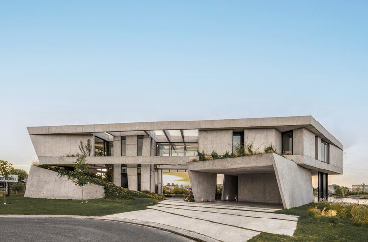
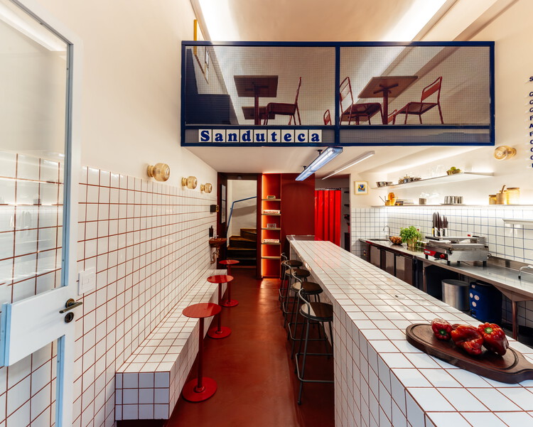
Lomadas House, Argentina · Sanduteca – Sandwich Library, São Paulo
At Lomadas House, Grizzo Studio places a perforated metal screen behind the concrete frame at the rear of the home. The screen is deep enough to read as architecture, but open enough to preserve a relationship with the garden. Light passes through the pattern during the day, while the view becomes more layered from inside.
Sanduteca uses perforated blue metal in a more compact commercial interior. The sheets and pendant element give the sandwich library a distinct identity without turning every surface into a sign. Stainless steel counters and shelves bring a harder, more practical note to the service zone. The contrast is useful: perforation controls the visual field, while stainless steel supports contact, cleaning and repeated use.
For designers, the lesson is to define the screen's job before choosing its pattern. Pattern density, panel depth, lighting and the finish behind it will decide whether the result feels light or congested.
02 / Thresholds with a ceiling line
Canopies and overhead metalwork set the pace of arrival
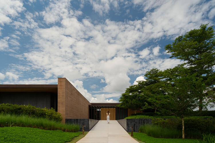
Tear House, Brazil · Locke London Canary Wharf, London
Tear House uses a lightweight metal and timber roof canopy to extend the house beyond its concrete frame. The canopy is not simply protection from the weather. It creates a shaded intermediate zone, makes the glazed edge more inhabitable and gives the approach a clear horizontal measure.
In Locke London Canary Wharf, Holloway Li works with a different kind of threshold. Chrome-dipped decorative framing, folded stainless steel, blue lacquer and high-level mirrors bring a 1960s reference into a contemporary aparthotel. The reflective surfaces make the route through the public areas feel more animated, but the effect depends on restraint. Metal is concentrated around frames, counters and points of encounter rather than spread across every wall.
Both projects show why ceiling, soffit and canopy details deserve early attention. They are read from below and experienced in motion, so panel size, access, drainage, lighting and structural edges determine whether the threshold feels crisp or improvised.

03 / Finish as atmosphere
Patina and reflection give hospitality interiors a sense of time
The Driskill Hotel, Austin · The Gunter Hotel, San Antonio · Six Senses London at The Whiteley
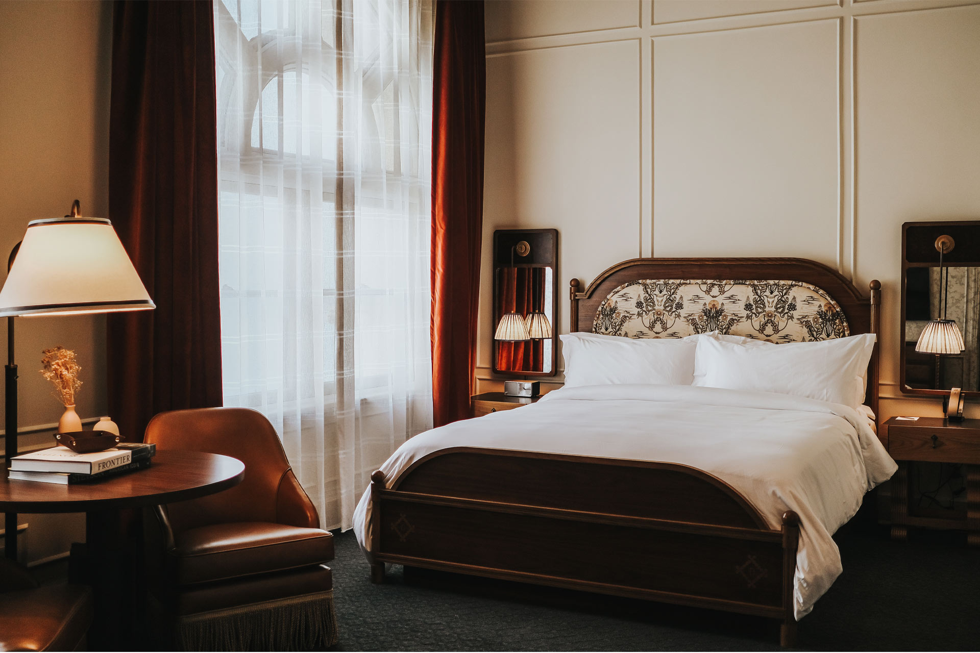
Recent hotel renovations in Texas use brass and bronze to make new work sit comfortably beside historic character. The Driskill combines burnished brass hardware, blackened bronze lighting, unlacquered brass and a pewter bar with walnut burl and other tactile finishes. The Gunter Hotel takes a related direction with a fluted brass bar, polished brass accents and Art Deco lighting.
These examples are not about making every metal surface bright. The value comes from choosing where it should catch light and where it should absorb it. A polished edge can mark a bar, while darker or patinated metal can recede and develop a less showroom-like character.
Six Senses London at The Whiteley shows how the same principle can work in a heritage setting. Restored wrought-iron pieces and brass accents are used alongside marble and preserved architectural elements. The metal does not imitate the past; it helps the new hospitality programme sit within an existing visual memory.


04 / The useful detail
Material character is strongest when it supports use
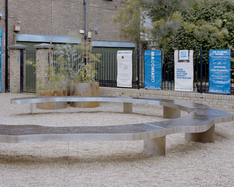
For commercial design, atmosphere and performance are not separate conversations. A bar, counter, display or lobby screen is handled repeatedly and seen at arm's length. A planter faces weather and impact; a ceiling or canopy must coordinate with lighting, structure, access and drainage.
That is why the projects above are useful references for more than their images. They show where to concentrate detail: at the edge of a screen, around a door, under a canopy, across a bar front or at the meeting point between metal, stone, glass and timber. A clear material hierarchy makes custom fabrication easier to judge and keeps the room legible.
Use reflection selectively
Mirror, chrome and polished surfaces work best at controlled moments where they can pick up light, movement or a view.
Let the finish carry scale
Brushed, oxidised, blackened and patinated surfaces can give a large plane more depth without adding visual noise.
Design the joint early
Panel breaks, returns, reveals and transitions to stone or glass should be resolved with the visual rhythm of the room.
Separate touch from background
High-contact counters, handles and trims may need a different finish strategy from screens, soffits or facade panels.
Think in light conditions
Daylight, warm hospitality lighting and reflected planting can make the same metal appear entirely different.
Keep maintenance in the brief
Finish selection should account for cleaning, fingerprints, weather exposure, access and the way a surface will age.
Conclusion
Across the selected projects, metal is being used as a mediator between solid and open, old and new, practical and atmospheric. Screens filter views, canopies shape arrival, and brass, bronze, chrome and stainless steel give particular touchpoints a distinct depth. The most durable design direction is not a single finish; it is a disciplined relationship between material, light, scale and use.
At Xinmao Metal, we follow global architecture and interior design trends to understand how custom stainless steel and architectural metalwork can support increasingly ambitious commercial and hospitality spaces.
Project References
ArchDaily · Published July 24, 2026 · Grizzo Studio · Original article
ArchDaily · Published July 26, 2026 · OUT Architecture · Original article
ArchDaily · Published July 25, 2026 · Estúdio Cajalima · Original article
ArchDaily · Published July 28, 2026 · Felipe Caboclo Arquitetura · Original article
Sleeper · Published July 21, 2026 · Holloway Li · Original article
Sleeper · Published July 22, 2026 · Project team credited in source article · Original article
Sleeper · Published July 27, 2026 · DLR Group · Original article
Hospitality Design · Published July 21, 2026 · Six Senses / project team credited in source article · Original article