
Project & Engineering · Design Study
Six architectural projects, six ways to think about the surface above us. From reflection to repetition, the ceiling helps set the character of a room.
A metal ceiling can brighten a restaurant, give a large hall a clearer rhythm, or make a busy interior feel quieter. The material matters, but the first decision is spatial: what should people notice when they enter, and what should stay in the background?
Reflective stainless steel, perforated panels, open baffles and honeycomb-backed metal all offer different answers. Their value becomes clearer when we look at the whole room rather than an isolated finish sample. The following projects suggest several ways to approach ceiling design, from the movement of reflected light to the proportions of a deep coffer.
1. Sir Joan, Ibiza: reflection as part of the atmosphere

At Sir Joan, Baranowitz + Kronenberg draws on the maritime character of Ibiza. The IZAKAYA interior combines walnut, polished metal details and a polished stainless steel lamella ceiling. The ceiling belongs to the same material story as the room below it.
This is a useful starting point for reflective ceiling design. A bright metal surface will pick up nearby colours, lights and movement. Its appearance depends on what surrounds it. Warm timber can soften the impression of polished metal; a dark background can make its highlights more distinct.
For a water-ripple ceiling, the question becomes more specific: how much movement should the surface introduce? A pronounced texture can be effective above a bar or reception desk, where it marks a destination. Across an entire low room, the same treatment may compete with furniture and lighting. That is a design judgement to test at room scale, not a performance claim about any particular panel.
Place a reflective sample in its intended orientation and view it with the proposed lighting. A sheet examined vertically in a showroom will not show what guests see when it is installed overhead.
2. Opera Park, Copenhagen: a perforated ceiling that reads as one surface


Cobe’s Opera Park connects a planted landscape and greenhouse with parking below. The underground areas use black custom metal ceiling tiles. DAMPA describes perforations that continue over the tile edges, supporting a consistent surface around the project’s curved geometry.
The design lesson is about continuity. A perforated ceiling may look like a field of texture from a distance, but panel borders can interrupt that reading. A solid strip around every tile produces a much stronger grid than a pattern that approaches the edges.
Neither approach is inherently better. A visible grid can suit an ordered interior. A quieter field can support flowing walls or curved circulation. Decide which reading the room needs before choosing the perforation layout.
The background is part of that choice. Hole pattern, panel colour and what is visible behind the panel work together. Review them as an assembly rather than approving the metal face alone.
3. Danske Bank, Copenhagen: letting the material remain legible
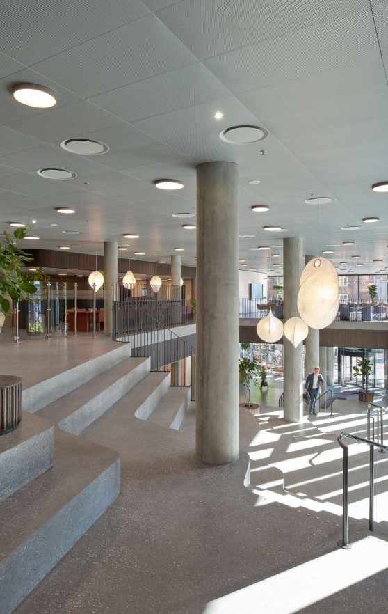
At the Danske Bank headquarters, DAMPA’s account describes perforated raw aluminium with a clear protective finish and grey acoustic felt. Here, the visible character of the metal and the backing colour are both part of the ceiling’s appearance.
For a workplace, a restrained finish can leave room for furniture, planting and daylight to carry more of the visual interest. Perforation adds another scale of detail: subtle from across the room, more apparent when viewed nearby.
Look at that texture from both standing and seated positions. A finish chosen from a close-up photograph may feel quite different above a meeting table. Also distinguish appearance from acoustics: visible holes alone do not establish the sound absorption of a proposed ceiling assembly.
4. Middleton Hall, Milton Keynes: openness without losing a ceiling plane


The replacement ceiling at Middleton Hall in centre:mk uses white metal baffles. Hunter Douglas’s project account describes the effort to retain the ceiling height within the listed building while accommodating the renewed systems above.
Baffles offer an interesting visual balance. From one position, repeated vertical faces can suggest a substantial ceiling plane. From another, the gaps reveal its depth and openness. Their direction can reinforce the length of a hall or help distinguish one zone from another.
That changing view deserves attention in the design stage. Study the main entrance, cross-room sightlines and the view from beneath the baffles. Consider the background above them too. An open ceiling can reveal equipment that a rendering has quietly omitted.
5. Hamad International Airport, Doha: making a broad white plane convincing

Hunter Douglas’s account of the Concourse C expansion describes a move from single-skin white metal panels to honeycomb panels to meet the project’s flatness requirements. The design issue is easy to understand: across a broad ceiling, small surface deviations can become conspicuous under light.
In this application, honeycomb describes the core within the panel. It does not mean that passengers see a hexagonal pattern. Its contribution is behind the visible face, supporting the intended appearance of a smooth metal surface.
A quiet ceiling is often demanding precisely because there is little visual texture to distract the eye. Panel proportions, joints and lighting should be considered together. The aim is to make the finished plane convincing from normal viewing positions, rather than simply selecting the largest available sheet.
6. LAX Terminal 4: using depth to give a large interior rhythm

CertainTeed’s Terminal 4 case study describes large coffers combining extruded aluminium frames, aluminium honeycomb vertical walls and fibreglass acoustic top panels. This is a mixed-material ceiling, not an entirely metal or entirely honeycomb assembly.
The coffers show another role for metal: defining an architectural framework. Their depth and repetition give the overhead space a readable order, while other materials contribute within that framework.
For a lobby or public interior, coffer design starts with proportion. Consider how each opening relates to the room, the column layout and the areas where people gather. Lighting then needs a deliberate place within the composition. A fixture added late can disturb a pattern that otherwise feels carefully resolved.
Choosing the ceiling the room actually needs
These projects offer different priorities. Reflection can bring activity overhead. Perforation can create a continuous texture. Baffles can introduce depth and direction. A smooth honeycomb-backed face can support a deliberately quiet plane, while coffers can organise a large space.
Start with the room’s intended atmosphere, then choose the material treatment that supports it. Review the ceiling beside the walls, floor, furniture and lighting. Reserve technical detail for the points where it protects the design: maintaining a surface, keeping a pattern continuous, or making an integrated light fitting sit where it belongs.
A well-designed metal ceiling should make sense in the room long before anyone asks how it was made.