
architecture & design · design insight
A sign belongs to a building when its information hierarchy, material depth and route arrive as one coordinated decision.

A sign is usually noticed as a letterform, a marker or a glow. On site it is first encountered as a decision: where do I enter, which route do I take, and how do I know I have arrived? Architectural metal signage belongs when those decisions are drawn with the structure, access routes and service plan—not added as a beautiful plaque at the end.
01 / route before object
Draw the route before the sign
Shenzhen Runlongyuan architectural signage · residential wayfinding · COSUN SIGN
The first drawing should not be an elevation of a pylon. It should be a route map. Mark arrival, choice points, changes of level, rooms, accessible alternatives and confirmation points. Test the sequence from the driver's seat, pavement and lift lobby. A sign family can look consistent and still fail if information arrives in the wrong order.
The Shenzhen Runlongyuan architectural signage project by COSUN SIGN provides a documented example. Its page describes a hierarchy from community arrival to route selection, building, unit and floor identification, then destination confirmation. Vehicle and pedestrian sequences are separate but linked. This is a wayfinding brief before it is a metal brief.
02 / hierarchy in depth
Give each information layer a physical register
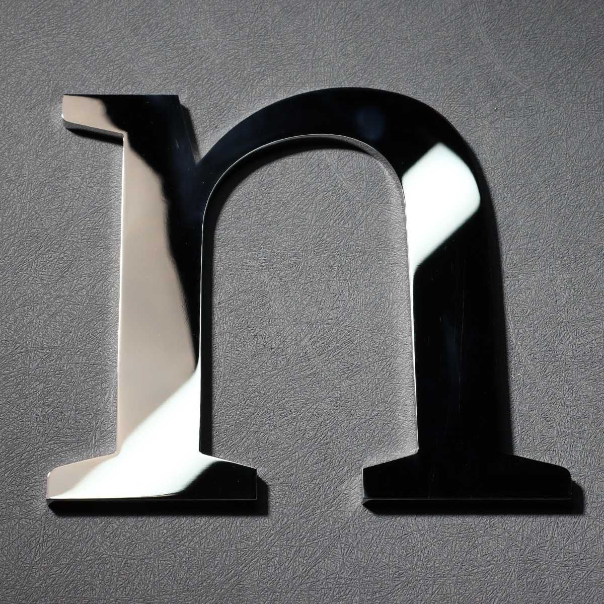
Runlongyuan · arrival identity, building recognition and close-range confirmation
Once the route is clear, assign each information layer a place in the building. A distant arrival marker can be tall and quiet; a building name needs a readable face; a room identifier needs a reliable plane and repeatable rule. The point is to make hierarchy legible before material richness takes over.
Runlongyuan shows how one family can change scale without losing identity. The project page reports 304 stainless steel with a champagne-gold electroplated and sandblasted treatment, a 25 mm milky-white acrylic illuminated face and waterproof warm-white LED modules; its specification notes 3000 K/4000 K in context. Exterior pylons are laser-cut, bent and welded, with thickness adjusted to structural and visual requirements. These are project choices, not defaults.


Ask what must be recognised from far away and what can wait until close range. That answer controls letter height, contrast, face depth, projection, illumination and whether a sign competes with a door, planting, guard or vehicle sightline.
03 / legibility in section
Let legibility enter the section
Accessibility, viewing distance and local code · a U.S.-specific technical example
Accessibility is not a final artwork check; it changes the section and viewing position. The U.S. Access Board’s Chapter 7 guidance is one U.S.-specific reference for non-glare surfaces, light/dark contrast, tactile characters and Braille, viewing-distance-dependent character height, and tactile signs generally mounted 48–60 inches above the finished floor. The ADA standards overview provides official context.
Those numbers are not an international template: the authority having jurisdiction and local code govern. Set viewing distance, route, sign type and mounting zone together. A visual sign may need a clean decision-point face; a tactile sign may need a separate reachable location; an illuminated marker needs power and brightness reviewed from the approach. A refined metal face that produces glare or an unreachable tactile zone has not completed the design.
04 / family, not sameness
Build a family that can change without losing its voice
Ellisse by Spacemade · workplace wayfinding · Glyphics
The workplace project Ellisse by Spacemade shows a granular family. Glyphics reports 10 mm solid aluminium frames with 3 mm faces and applied vinyl for navigational signs; projecting signs use shaped frames with 1 mm stainless-steel faces. Meeting-room plaques use 5 mm aluminium frames with 1 mm stainless faces, while office numbers and amenity icons use other substrates. Hierarchy, motif and placement rules create coherence; one thickness is not forced everywhere.
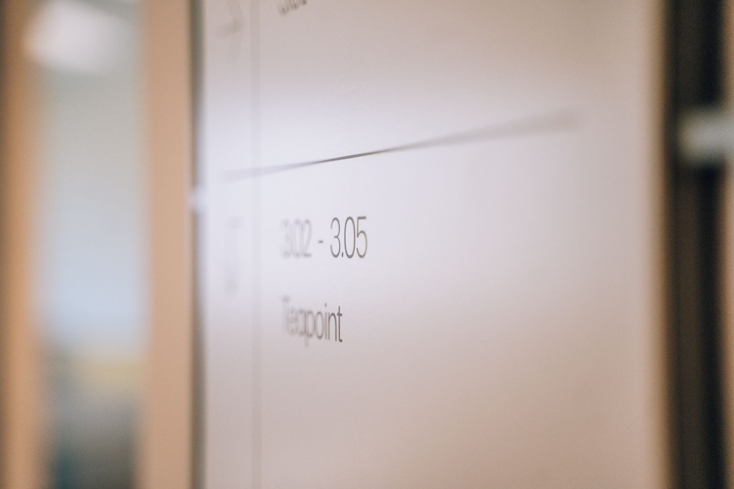
The record also describes surveying, planning from floor plans, walking routes, measuring glass and coordinating fabricators, installers and electrical contractors. That sequence matters more than the ellipse. A family becomes buildable when every type has a location, substrate, fixing zone, service assumption and replacement logic.
At MJMA’s Architecture & Design Studio signage, the brick-and-beam factory supplies the organising device. RGD describes aluminium, steel and wood signage around the column-bay grid; black laser-cut numbers and pictograms reveal the columns, while channel letters and interpretive panels extend the programme. The family belongs because it repeats the building’s order.

05 / marker as place
Let a public marker do more than point
City Views · Eastern City, London · London Festival of Architecture
Wayfinding can also make a destination memorable. City Views by the London Festival of Architecture is listed as a permanent installation, street-furniture and wayfinding project for Eastern City BID. Four sculptural pieces sit outside Lookout at 8 Bishopsgate, Horizon 22, Garden at 120 and Sky Garden. The page describes steel and stone, bespoke bases, embedded text and engraved skyline baseplates. The marker orients people and invites a pause.


Ask what happens after the direction has been read. A base can protect the marker and offer a place to stop, while bringing paving, drainage, lifting, impact and accessible clearance into the package.
06 / depth with a reason
Choose metal when depth earns its place
VHIR signage · Barcelona · BAAS · direct-to-surface contrast
Not every architectural sign needs a fabricated body. The completed VHIR signage at Barcelona’s VHIR campus uses typography from façade to paths, with paint glazes on concrete and high-adhesion vinyl on wood, metal, concrete and glass. BAAS describes no physical supports. Direct graphics can be right where the architecture should remain continuous.

Metal earns extra depth when a project needs a separated face, robust edge, projecting marker, tactile component, replaceable module, service route or shadow line. State the reason in the sign schedule so direct graphics are considered honestly and fabrication is not mere decoration.
Questions to resolve before the sign leaves the shop
What should be fixed first: the letterform or the route?
The route. Confirm visitor decisions, then assign messages and viewing distances. Refine letterform, frame and metal language after the information order is stable.
When is direct-applied graphics better than fabricated metal?
When the substrate is suitable and separate depth, tactile hardware, projection, replacement or service access is not needed. VHIR documents that approach.
How should accessibility enter a metal sign family?
At route planning and section design. Set contrast, glare, character height, tactile/Braille provisions, reach zone and approach clearance with local code and the authority having jurisdiction, not a late artwork review.
How do illuminated signs stay maintainable?
Show drivers, cable routes, isolation, removable faces, drainage and replacement access with the sign. A night image proves appearance, not serviceability.
Runlongyuan starts with a sequence of decisions. Ellisse turns a motif into a family; MJMA lets the column grid organise identity. City Views gives orientation a civic pause, while VHIR shows that belonging can mean leaving the wall uninterrupted. Architectural metal signage succeeds when information, material depth and building coordination arrive as one release. The sign is part of the architecture because the route shaped the object.
Project References
Shenzhen Runlongyuan architectural signage and wayfinding
COSUN SIGN · project page accessed 8 September 2026
Ellisse by Spacemade
Glyphics · project page accessed 8 September 2026
City Views
London Festival of Architecture · 2025–present · photographer Luke O’Donovan
MJMA Architecture & Design Studio signage
RGD · 2026 award page
VHIR signage
BAAS · completed 2026
Chapter 7: Signs
U.S. Access Board · technical guidance; U.S.-specific example